Create your own font entirely and for free
This article was published before 2022, therefore before the rise of generative AI. Some information may now be outdated. The period drawings and visuals shown here were created without the assistance of artificial intelligence.
Today, integrating a specific typeface onto a web page has become easy. The temptation, for many reasons, to create your own font is strong. In my case, let’s be completely honest, it started as a good ego trip: the ego trip of seeing my own handwriting usable however I wanted, in every software I wanted, just like that! One could go on at length about the reasons for creating your own font, since there are fortunately many others, but that is not the point here. Creating your own font is within reach of the first fool who comes along, since I managed it! And it can be done for free. And that is the experience I’m going to share in this article!
Create your own font!
Create your font
First of all, you need to distinguish fonts with ligatures and those without, since my font has no ligatures (connections between characters). That makes things quite a bit easier!
If the font you want to create starts from a real handwritten version (like mine), you’ll need to write out the entire alphabet and scan it! The first version will therefore be a raster image (or bitmap). Don’t hesitate to scan at a fairly high resolution (or draw your letters a little larger to avoid the ink wandering on the paper). But if you want to create your own font directly on the computer, use vector software directly (Inkscape, Illustrator, etc.).
Each character will need to be worked on independently. In typography, each character is called a “glyph”. The standard Latin alphabet consists of 26 characters that we all learn at school. But as soon as you want to take into account “accented” or “ligature” characters, know that French already includes 42 glyphs. And, of course, if you’re a filthy perfectionist like me and want to go all the way, you can also add lots of “other” characters, such as punctuation, mathematical characters (1, 2, +, -, <, >, %), or currencies (€, $)… And, finally, staying within Latin characters, know that there are still other special characters depending on the country! + the uppercase letters after that…
In short, creating a typeface that includes every possible character only requires your patience as a limit! Good luck, because in the end, it’s fun!
Pan(ta)gram
If you want to list the characters, there is a simple trick called a “pangram”. Like me, you may not have known the name, but we’ve all seen them! When a font is installed on a system, most operating systems display one! It’s a sentence containing all the “glyphs” of a language. In French, it gives: “Portez ce vieux whisky au juge blond qui fume”, in a version with “non-accented characters”. Otherwise, with accented characters, it gives: “Dès Noël où un zéphyr haï me vêt de glaçons würmiens je dîne d’exquis rôtis de bœuf au kir à l’aÿ d’âge mûr & cætera !”.
Yes, the French language contains the letter ÿ! If you want to extend your alphabet to particular foreign languages, referring to the translated pages of the Wikipedia article was my method: “pangram” proves to be very helpful.
Vectorization, captain
Well done, you’ve just scanned your little scribbles! Now you need to vectorize them. Nothing monstrous about that. You can do it via Illustrator, or if you want only free software (and legal stuff, hehehe :s), via Inkscape! No special constraints: black and white, no halftones. So make sure to work on the bitmap beforehand by increasing the contrast, and see whether it doesn’t damage your handwriting too much. If you vectorize in Illustrator, you’ll need to export your file in SVG.
The font file
Here, I didn’t invent anything either; I just followed this excellent tutorial. It explains that Inkscape is perfectly designed and thought out for creating a font, and even comes with a sample file! However, you will only be able to export your font from Inkscape as SVG. After that, nothing too terrible: you carry out, like a laborious drudge, the tedious task of copy-pasting letter by letter, entering the corresponding info, and getting used to the Inkscape interface where, sadly, everything is not entirely intuitive!
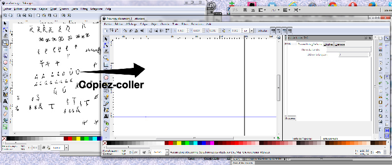
Demonstration of the font copy-paste
But once you’ve learned the first mechanisms, nothing too tricky. Don’t be afraid to let the letters extend beyond the frame; they will still appear whole in the end! Don’t worry about the letter spacing either; that step comes later, and it’s easier to handle in the next software. Finally, if you don’t understand why, when you add a letter made of two shapes after having used “Get curve from selection”, only one of them is taken into account, don’t panic, that’s normal: you need to use “Path” > “union”, and then it will work!

Screenshot of Inkscape with composite letter
Save
Don’t hesitate to save regularly! An accident can happen so quickly… ! In the tutorial linked above, you’ll see that Inkscape allows you to define “kerning“, that is, letter spacing. But I recommend doing that later with FontForge.
What’s going on, we’ve lost control of the Inkscape shuttle!
You saved your SVG (“mafontquidechire.svg”), went to get your coffee, and your Windows crashed. Bang. No worries, you tell yourself, you’ve saved the font! You launch Inkscape and reopen your SVG file. Except now, it’s a disaster: you can clearly see the glyphs in the associated window, but you can no longer edit them! That’s “normal” in the sense that the font implementation in Inkscape is still relatively recent, and the developers are working hard to improve things, as you can see here. For now, Inkscape is only intended for the creation/design stage, and only provides SVG export.
Into the big leagues
Don’t panic! Your file is actually fully usable! You just need to open it with the right software! Namely FontForge in this case (though there are other programs, but most are paid, and since that’s not the topic of the article…).
You’ll need to refine, normalize, and work on your little SVG to generate a TrueType typeface (.ttf). To do this, you’ll need to download and install FontForge (to learn more about the creator).
The glyphs
The FontForge interface has two main panes: the list of all glyphs, and the editing area for each glyph you choose to focus on.
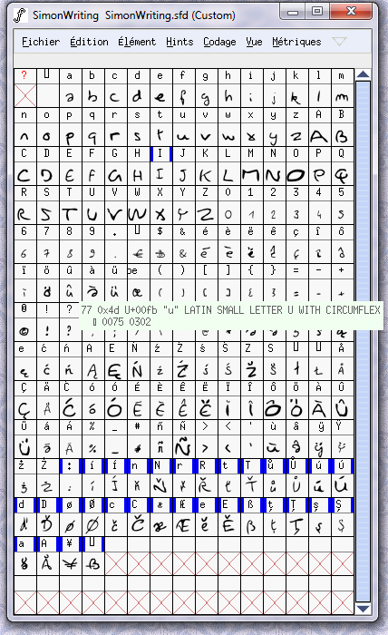
My character set in FontForge.
Here too, I’ll let you discover the software for yourselves. But since I’m not entirely ungrateful, here are a few tips that may be useful:
– Work directly by groups of letters; it’ll go faster. To do this, select the glyphs simply by clicking and dragging on the interface. Then you’ll have a whole bunch of commands that allow you to standardize the characters;
– Metrics > left / right side bearing > allows you to apply uniform spacing values on each side of each letter.
– Element > Round > allows you to round the coordinate values of each letter’s Bézier curves, making them saveable for TTF export.
– Element > Correct direction > allows you to correct, point by point, imperfections in the paths generated by Inkscape.
You’ll often need to use the Element > Validate function before exporting your font.
Here too, a long-term effort awaits you; you’ll end up with many error messages and various validations that I won’t list here. But it’s worth the effort.
Epilogue
If you’ve managed to export your font in .ttf, then all that’s left is to use it wherever you like, and convert it as needed if another format is required, via the multitude of existing online tools. Such as Font Squirrel, one of the oldest around (but it requires Flash)
If you want to add letters to your character set, you can always draw the letter in Inkscape and import it into FontForge as explained by this tutorial.
Finally, if you want to see what the font set I created looks like, here it is again.
I hope this was useful to you!